
If you build a display: flex layout, to fit items in a responsive two-column layout (flex: 0 0 50%), you will probably recognize a stretching-issue on an odd number of items.

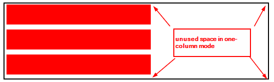
One cannot use flex: 1 50%, because this always stretches the last item over 2 columns, whereas the one-column mode looks well.


How to get both?
The solution is a trick, done with calc and playing around with potentially negative flex-basis. In this case the min-width comes into play (2-column means 50%). In one-column mode, the flex-basis is very large, whereas the max-width fits it to a maximum of 100%.
.container {
    display: flex;
    flex-wrap: wrap;
    // breakpoint for single column: 568px
    --multiplier: calc(568px - 100%);
}
.item {
    min-width: 50%;
    max-width: 100%;
    flex: 0 0 calc(var(--multiplier) * 999);
}
Enjoy!

